
Wedding Slideshow Design:
5 Visual Rules That Keep Photos Feeling Like One Story
Edited by Dear Ever | Published:
In this guide
Photos from different years, cameras and formats do not need to look identical. Set a few repeatable visual rules first, and guests can keep their attention on the story rather than re-learning every new slide. This guide gives you five decisions and a one-page brief for DIY editing or a maker.
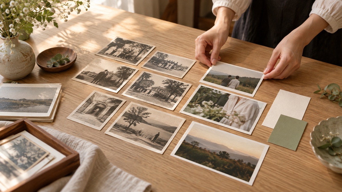
Dear Ever wrote this for couples who already have the photos and want the finished film to feel coherent. It is not a call to make every page more elaborate. If you still need to choose and order photos, start with the wedding slideshow preparation guide; if you already have a draft, use the draft review guide.
Choose one direction before changing templates
Consistency is not one colour or making every old photo look new. It means that the next frame still feels like part of the same film: similar text placement, breathing room around photos and a familiar chapter cue. One direction is enough, such as “photo-paper margins, charcoal text, gentle fades” or “full-bleed photos with titles only on chapter cards”.
Important vertical photos or a card that needs readable text can be exceptions. Give an exception a reason; do not create a new visual rule every time a new effect looks appealing.
The 5 visual rules to decide first
| Rule | Decide first | A reasonable exception |
|---|---|---|
| 1. Chapter cues | Will there be an opener, three chapter cards and a closing card? Use one typeface and layout for them. | When there is little text, let one photo open a chapter while keeping the same margin or colour treatment. |
| 2. Photo crops | Will landscape photos fill the frame or keep borders? Will portrait photos use space, a soft background extension or paired images? | Keep space when cropping would remove a person or relationship that matters. |
| 3. Text | Will you use only chapter titles, or one factual line where guests need context? Fix its position, length and typeface. | Add one line to identify a person or event; do not invent uncertain dates. |
| 4. Motion and transitions | Use one or two simple transitions and a similar pace for zoom or camera movement. | Slow down a chapter opening so guests know the time or setting has changed. |
| 5. Visual density | Will most frames show one main photo or paired photos? When there are several, which is the lead image? | Use a collage only to compare childhood and now, or to explain one event. |
Old and new photos do not need the same image quality
Fading, grain and worn edges belong to an old photograph. Scan it and correct its orientation so people can be seen, then decide whether it needs a small brightness adjustment. You do not need to sharpen every old photo until it resembles a modern phone image. Shared margins, a background colour or photo-paper borders can do more to connect them.
Portrait phone photos often interrupt the rhythm. Keep space, extend a soft background, or pair two related portraits. Choose one of these as the main approach so the audience is not re-adjusting to the layout every few seconds.
Order the story before adding effects
Visual rules cannot rescue unsequenced photos. Give each person’s childhood, meeting and life together a basic order first. For similar travel shots, selfies or group photos, keep the one that best explains the event. The repeated-memory check helps you choose.
More effects do not automatically show more care. When every slide has a different animation, guests watch the effects rather than the people. Gentle fades, simple dissolves or consistent slow movement are enough; fix unreadable text, rushed faces and unclear memories first.
A one-page visual brief for DIY or a maker
Complete this before editing. It makes later feedback a question of whether a frame follows the rules, rather than a request to remake the whole film.
Story chapters: ________ (for example: childhood / meeting and life together / the wedding)
Main layout: ________ (for example: landscapes full frame; portraits with cream space)
Text: ________ (for example: chapter titles only; one line only when context is needed)
Type and colour: ________ (for example: one charcoal typeface; no extra colourful fonts)
Motion: ________ (for example: fades; slower at chapter openings)
Exceptions and boundaries: ________ (for example: do not crop faces; no embarrassing photos; no new template on every page)
How much can each making method change?
DIY tools usually let you adjust crops, text and transitions page by page; check the DIY tool comparison for free-plan, watermark and export limits. Dear Ever is for couples who want to spend their time on photos and story rather than page-by-page layout: the platform directs camera movement, pacing and music, rather than offering a bespoke design service. You can preview without limit before paying; the finished version is HK$799 and includes a watermark-free 1080p MP4, subject to the current terms. If every caption, collage and animation must be specified, DIY editing or a page-by-page design service is a better fit.
Want to see how photos work with a fixed cinematic camera and score before deciding whether you need page-by-page design?
Watch the full Provence example Preview for freeTopic reference: WED Magazine: How to Make a Beautiful Wedding Slideshow (read October 12, 2026). This is Dear Ever’s independent editorial guidance, not a customer case, design-service promise or measured outcome.
Related reading
 Ways to make itWedding Slideshow Prices in 2026: 11 Providers Compared. Is Pricier Better?How much is a wedding slideshow? Photo slideshows list at HK$800–1,500, often included with photography; filmed MVs and AI films HK$6,800–13,800. Prices from 11 official sources, why they differ and extra charges.
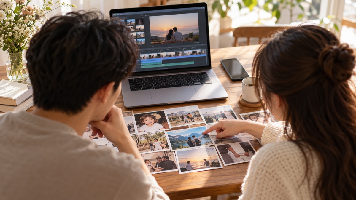 Ways to make it5 Popular Free Wedding Slideshow Apps: Canva, Clipchamp, iMovie, CapCut and AnimotoCompare Canva, Clipchamp, iMovie, CapCut and Animoto for devices, editing effort, 1080p export, watermarks and paid limits, with official screens, examples and start steps.
 Ways to make itHow to Compare Wedding Slideshow Quotes: 4 Hidden Conditions in 7 Published PlansCheck 4 conditions before comparing wedding slideshow quotes: standalone, add-on or package deduction; photos, filming or AI; draft vs final date; revisions. With 7 official sources, method and a free CSV.
 Ways to make itCanva Wedding Slideshow Guide: Turn Photos into a Reception-Ready FilmMake a Canva wedding slideshow from photo selection and 16:9 layout through timing, music, MP4 export and venue testing, with watermark and rights checks.